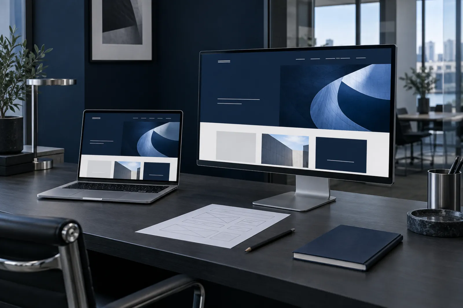
The first screen should help visitors recognise the right place.
Imagine someone opening the website for the first time, knowing only the company name. Can they tell what you do and who you work with? Can they see a route to the offer? A striking photograph or animation can give the site character, but it also needs information that helps people take the next step.
Do not try to fit the entire offer into the first view. Select what helps visitors get their bearings and organise the details below. If a large brand mark leads the opening, a short description and clear navigation can explain the scope without adding competing slogans.
Describe services through customer decisions, not department names.
A company’s internal structure rarely makes the best navigation. Customers think about a problem: organising orders, replacing a website or automating a report. Help them choose the right path with names they understand without knowing your team.
Every important service should explain who it is for, what it includes and how working together happens. Show its limits too. Explaining when a service is not the best choice can help qualify enquiries. Replace general claims about a personal approach with an example of a decision you actually make during a project.
- What situation brings the customer to you?
- What will the collaboration produce?
- What information is needed to agree the scope?
The essentials to start with

The opening view should provide orientation and a simple route to the offer.
Every service needs a specific scope, process and answers to customer questions.
Actual projects and illustrative scenarios must be clearly distinguished.
Show evidence, or clearly label an illustration.
A project description is valuable when it explains the problem, decisions and work delivered. A collection of attractive screens says less. If you can publish outcomes, establish their source and context. Do not attribute an entire business change to one part of a project without justification.
A new brand can still tell an interesting story. An illustrative use case shows a way of thinking and a proposed solution path. It simply needs to be described as a scenario rather than suggesting an existing customer. Similarly, generated artwork can explain an idea but should not pretend to be a photograph of a team, facility or completed implementation.
Decide which subjects deserve their own URLs.
A separate page makes sense when it answers a distinct question and contributes its own content. Someone looking for an employee application needs a different explanation from someone commissioning a service website. Both subjects can meet on the homepage, while their details are better organised separately.
Connect the content: from a service to a use case, from a guide to the relevant help. Link labels should explain what awaits after a click. This makes navigation easier for people and content discovery easier for search engines. Avoid multiplying near-identical pages just to repeat a different keyword.
- Homepage: orientation and choosing a direction.
- Service: scope, process and answers to concerns.
- Example: the problem and the logic of the proposed solution.
- Guide: help with a specific decision before making contact.
Plan images as part of the story.
A photograph can show a product’s scale, a detail of craftsmanship or its context of use. An illustration can simplify a complex process, while a diagram explains relationships. Before commissioning materials, write down what the customer should learn from them. Another decoration without a purpose soon begins to compete with the offer.
Adapt framing to phones and computers. Prepare files at sizes appropriate to where they appear. Important content should not be available only inside an image. Alternative text should explain an image’s meaning when it communicates information; decorative elements do not need an artificial description stuffed with search phrases.
Contact should make sense before anyone presses the button.
Users should know whether a button will open a form, begin a conversation or download something. Ask only for the information needed for the next step. A detailed brief can be useful later, but not every first-time visitor knows the budget, scope and full set of requirements.
Check the route from clicking to actually receiving the message. An on-screen success notice alone is not enough. A form should identify errors in specific fields, retain entered content after a failed attempt and clearly confirm the outcome. Phone numbers and email addresses must be current and belong to the correct brand.
Assess the finished website using real tasks.
Ask someone outside the project to find the right service, check how working together happens and begin making contact. Observe moments of hesitation rather than only asking whether they like the appearance. Repeat the exercise on a phone and a slower connection. The most important content must appear without waiting for every visual effect.
Before publication, check titles, headings, links, URLs and indexing rules. A rebuild needs a redirect plan for old addresses. After publication, agree who updates the offer and materials. SEO is work on the website’s usefulness, structure and development, not a ranking promise based on one technical change.
- Can customers identify the service without extra explanation?
- Do the materials reinforce the content and reflect reality?
- Does contact work, including on a phone?
- Is someone responsible for keeping the offer up to date after launch?
Bring this to your business
- Graphics should explain and build character, not replace readable content.
- Check the complete contact journey, speed and accuracy of the materials.